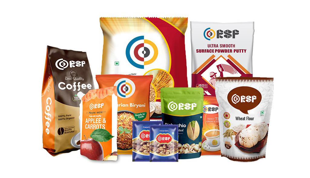
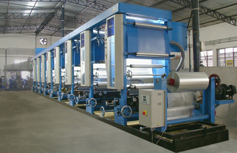
Imagine if by mistake the size of your logo comes x times bigger than your expectation or bigger than your product name. Imagine if a new guideline has been announced by the government and your product label does not comply with those guidelines. What if the colour that you saw in the software while the designer was making your design is not the same when you got a batch of 1 lac printed pouch or product packaging?
When it comes to product packaging designs there are too many if’s and but’s. The ones we mentioned above are just a gist of the reality. 7 out of 10 gravure packagers will cater any one issue from above cited to its customers. On the other hand the customer might not be even aware of them until they themselves take a close look into each packaging. And for the same reason, we are here to highlight you all the important things one need to take care in general while they work in Product Package Designing. To start with, let’s show you a list of significant elements which you need to take care.
- Product Sizing
- Sealing Area
- Colour Theme
- Clarity of Information
- Image Accuracy
- Government Guidelines
So let’s get going to 6 checkpoints that everyone should take care of their Gravure Designs and what can be the best thing apart from our experiences to cater you to make you understand them as a designer and printing giant!!
1. Product Sizing:
What does the product sizing has to do with the package design as a check point. A very basic but crucial check point when you begin with the entire packaging task at your designer or printer’s studio. When we talk about product sizing as a check point, we point the height and width of the product. Many times the actual size of the product differs from its expected size by its makers. A small glitch or minor mistake in the production line can create an unparalleled chaos at the printing end. Few years back, we had experienced a similar case for one of our clients. The client was into manufacturing and distribution of beauty soaps. The client had outsourced the process of building its cylinder to a third party. The dimensions were 120 mm (O.W.) X 80 mm (H) at expectation. Meanwhile the client had placed an initial order of 500kg. for their product packaging. Customer has given approval for color scheme as well as govt. norms written on packaging at the time of production of packaging on machine, But on the other end when the lots of 500kg. were ready for dispatch to client’s unit, Client was in shell shock state. Reason – Minor change in product sizing. The dimensions of the product were 120 mm (O.W.) X 80 mm (H). The decrease in the size of the product by 5 mm in width!! The printing of packing material were perfect but the product was not, resulting into zero monetary value of the entire lot of 500 kg. The minor difference / increase of 5 mm allowed the product to remain tight in packaging and it was of no use to the client. Surely the person with all the responsibilities and authorities is liable for the error but the major fault falls at client’s bucket, reason; the product was not ready yet and they ordered for packaging.
All said and done, what we intend to make you understand is the importance of product sizing. It’s always importance to check the size of the product before starting with the product packaging. If the products are ready to consume, pack the product with sample packaging for trial.
2. Sealing Area:
Most of the Gravure Packaging designers do not give much importance to “Sealing Area” of the product packaging. The designers most of the times do not consider the sealing area and design the product packaging from one end to other end. Due to this negligence, Designers put certain essential information on the sealing area itself.
The error falls to the eyes of the authorities when the product is ready for sealing. On sealing, you realize that certain important details or matter of the packaging are also printed on the sealing area and they are not clearly visible now due to the sealing has happened on it. As a business it’s not much of a worry as you are not losing any penny, the product is intact, the packaging is strong and sustainable but as a brand it impacts a lot from the consumer’s point of view. Error is Error, Small or Big. They bring the outcomes accordingly.
3. Color Theme:
Well, it’s not something that we have not told you before. In our other article “Why attractive designs are needed for packaging”(Give Hyperlink to the Named Blog), We had informed you about the psychological impacts through attractive designs for packaging. It’s little on the same lines, But from the designer, printer or manufacturer’s point of view.
When we say about color theme, it’s in general first impression of the product’s packaging, color combinations and fonts as a whole which comes in the minds of the ultimate users or consumers. Most of the designing houses or designers go for psychological viewpoints or attractiveness without understanding the basic and core demographics relevant to the product. There are certain demographics which goes in parallel to psychological combinations for the product packaging. For example, A beautifully and minimally designed product packaging of a successful FMCG product in an urban or metro region might not be much of an interest for people in rural or interior regions. Reason is the mindset of the people regarding color combinations. People from rural regions have an unusual taste for color combination or theme if compared to urban or metro living individuals. The same thought process goes for Sex, Age & Profession.
90% of the designers do not give a thought or think from the end users perspective and waste their time in designing something unique or excellence.
4. Clarity of Information:
Not in terms of the meaning of information labeled on the packaging designs, But in terms the matter readability. Yes, it’s always important to balance and keep appropriate spacing between the elements used, font’s size and style kept while designing with all the images, texture or themes. If there is complexity in appearance then consumers might not have a good impact of the product in one look.
5. Image Accuracy:
What you saw you reap. A well said proverb for most of the designers who scroll google and use royalty free or no copyright images and elements. It’s not just the designer’s to point the guns, but the chain goes till the hiring agency and client. Due to multiple reasons, Designers have to go search, select and download free templates, images, elements and vectors. The primary justification can be budget allocated for packaging. With low budgets from client’s or marketing agency (if involved) end, Designers or printers, Don’t give much effort, Don’t have much time in creating something new, and eventually have to opt in for using whatever is available for free on the internet as per the client’s feed and requirement.
The most common issue while using free templates, images and vectors as elements from the internet is the low quality or low pixels of the elements, Which in turn degrades the overall quality of the packaging when they go through the printing process.
6. Government Guidelines:
Last but not the least, it’s pretty much obvious to register and enroll the business products to the local authorities or governments for approvals and quality checks for standard consumer health or safety purposes. In return, the government or the governing bodies on behalf of the government in any particular business or product segment provides various certificates and marks for commencing the product selling. These certificates can vary from region to region. If the product is general in nature, a single industry standard running certificate also works. For example, If you are into the manufacturing and selling of food products then only FSSAI logo (certificate) will also work on your product label in India. The important part is to have those symbols or logos of government guidelines. It does not only affect the business legally, but it surely creates a negative impact in the mind of the customers who are looking forward to purchase your products, thinking the product is yet not approved from the government for consuming.
So that’s all we have got to make you all understand about all the checkpoints before and while going for your product labels. Pretty lengthy it was to summarize on all the checkpoints! But do promise for more when you place your first order at our printing station.
I am text block. Click edit button to change this text. Lorem ipsum dolor sit amet, consectetur adipiscing elit. Ut elit tellus, luctus nec ullamcorper mattis, pulvinar dapibus leo.


